
Why Mobile-First Design Matters in Singapore’s Urban Context
Singapore’s rapid transit culture demands interfaces optimized for quick browsing. We explore how mobile-first thinking shapes better digital experiences for everyone.
Read Article
Browse our essential resources and services
Four key steps to creating interfaces that work for busy commuters
We study user behaviour on MRT trains and understand thumb-reach zones during rush hour.
Create layouts with large touch targets and digestible content cards for quick scanning.
Validate interfaces with real users in transit environments to ensure actual usability.
Iterate based on feedback to optimize navigation zones and interaction patterns.
Principles that guide every interface we create for Singapore’s fast-paced urban environment
We design every element with thumb-reach zones in mind. Most interactions happen in the bottom half of the screen where users naturally hold their phones during commutes.
Touch targets are never smaller than 4444 pixels. Buttons have comfortable spacing so you won’t accidentally tap the wrong thing on a moving train.
Content lives in short digestible cards. No walls of text. We respect that commuters have maybe 5-10 minutes to browse before their stop arrives.
Navigation zones are positioned for easy access without requiring full-hand stretches. Every page loads fast on 4G networks and uses minimal data.
Real feedback from Singapore’s mobile-first users
“I can’t use most apps on the MRT. The buttons are too small, there’s too much text, and I can’t hold my phone steady enough to tap accurately during rush hour.”
“Finally an app I can actually use with one hand. The cards are easy to scan, the buttons are big enough, and I don’t need to scroll through endless content to find what I need.”
Real experiences from people who use mobile-first interfaces daily
“Wasn’t sure mobile-first design would make much difference until I actually tried using an interface built this way on my commute. The difference is night and day. Everything’s where my thumb naturally reaches, buttons are big enough that I’m not constantly misclicking, and I can scan through content in seconds. It’s the first app that actually works with my commute, not against it.”

Key benefits for Singapore’s urban professionals
Faster Loading
Easier Tapping
Quick Scanning
One-Handed Use
Less Data
Higher Success
Deep dives into mobile-first design principles and practices
Singapore’s rapid transit culture demands interfaces optimized for quick browsing. We explore how mobile-first thinking shapes better digital experiences for everyone.
Read Article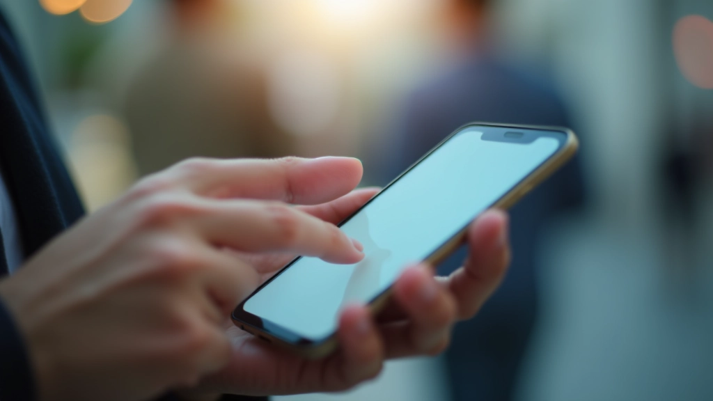
Why 4444 pixels isn’t arbitrary. We break down the science behind comfortable touch targets and how spacing affects accuracy on moving vehicles.
Read Article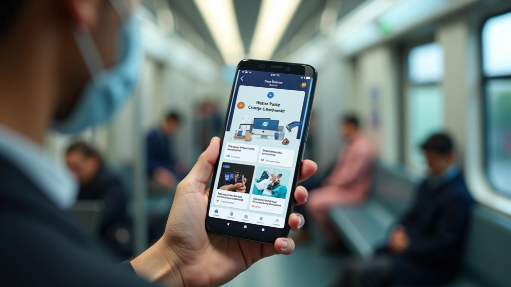
How to structure content into digestible cards that users can scan in 5-10 minutes. Real strategies for keeping attention spans engaged in transit environments.
Read Article